
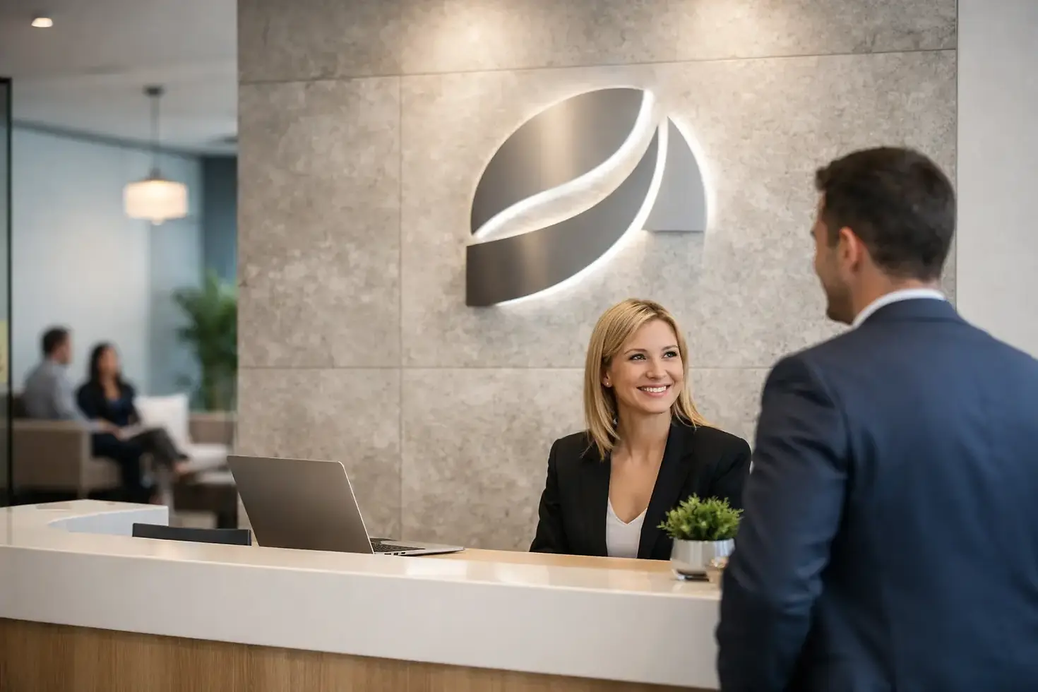
Reception Signage for Offices That Works Harder
- KEVIN RYAN
- 5 days ago
- 6 min read

A visitor forms an opinion of your business before anyone has offered them a coffee. The view from the entrance, the condition of the walls and the clarity of the welcome all carry weight. Well-planned reception signage for offices turns that first few seconds into a clear statement: this is who we are, this is where you need to go, and we take our business seriously.
For offices receiving clients, suppliers, applicants and delivery drivers, reception graphics are far more than decoration. They need to work hard every day, reflect your brand accurately and remain looking sharp after hundreds of visitors have passed through the door.
What reception signage needs to achieve
The best reception areas do three jobs at once. First, they create a confident branded focal point. Second, they guide people without making them hunt for information. Third, they support the practical requirements of the building, from accessible routes to meeting room directions and visitor procedures.
A logo on a bare wall may be enough for a small, private office where every visitor is expected. It is rarely enough for a busy commercial premises. If people arrive unsure of where to report, cannot identify the reception desk, or are greeted by faded vinyl and peeling lettering, the setting works against the team behind it.
The right approach depends on the space. A professional services firm may need a calm, understated installation that conveys discretion. A construction or logistics business may want a bolder, more industrial look that reflects the scale of its operation. Retail head offices, shared workspaces and public-facing organisations often need stronger wayfinding because visitors are moving through the building independently.
Start with the visitor journey, not the logo
Before choosing materials or finishes, walk through the arrival experience as if you have never visited before. Start at the car park or entrance gate, continue through the front door and stop at the point where a visitor needs to make their first decision.
Can they immediately see where to report? Is the company name clear from the entrance? Are meeting rooms, toilets, lifts and exits identified in a consistent style? Small gaps in this journey quickly become noticeable, particularly when guests are late for a meeting or when reception is temporarily unattended.
This review often reveals that the reception wall is only one part of the project. Door signs, frosted glass manifestations, directional panels, window graphics and branded wall coverings can all support the same experience. They should feel like one system rather than a collection of signs ordered at different times from different suppliers.
For multi-site businesses, this matters even more. A visitor walking into a Birmingham office should receive the same visual standard they would see at a Walsall, Staffordshire or Sutton Coldfield location. Consistent colours, logo proportions, typefaces and sign positioning protect brand recognition while still allowing for each building's layout.
Choosing the right reception sign materials
Materials are not just a design choice. They affect readability, longevity, cleaning requirements, budget and how the finished space feels.
Acrylic and built-up lettering
Acrylic logo panels and individual cut letters are popular for reception feature walls because they give depth without overwhelming the space. They can be mounted directly to a painted wall, set onto a contrasting backing panel or installed with stand-off fixings for a more architectural finish.
This is a strong option for businesses wanting a clean, permanent centrepiece. However, the wall needs to be surveyed properly. Uneven surfaces, concealed services and poor-quality plaster can affect the fixings and final alignment. Precision installation matters here. A slightly crooked letter is the sort of detail people notice immediately.
Printed wall graphics and murals
Wall vinyl offers greater creative freedom. It can carry large-format photography, patterns, company values, timelines, maps or full brand environments across a reception wall. It is particularly useful where a blank space needs energy but a built-up sign alone would look lost.
Printed graphics also suit companies that need to refresh campaigns, showcase projects or update messaging periodically. The trade-off is that image selection and colour management need care. Low-resolution artwork looks worse at large scale, and colours that appear correct on a screen can shift in print without proper profiling and proofing.
Metal, wood and specialist finishes
Brushed aluminium, stainless steel, timber-effect panels and premium laminates can add character where the interior scheme calls for it. These finishes work well in offices that want a more established, crafted or industrial look.
They are not automatically the best choice simply because they cost more. A material should suit the brand, lighting and surroundings. A highly reflective metal sign, for example, can be difficult to read under strong spotlights or through a glazed entrance. A good supplier will discuss these practicalities before fabrication, not after installation day.
Glass manifestations and window film
Glass partitions can make an office feel open, but they also create privacy, safety and wayfinding challenges. Frosted or printed window film can carry subtle branding, identify rooms and make large glazed panels more visible.
This is especially valuable around meeting rooms and reception entrances. The design should allow enough visibility for the space to remain welcoming while reducing distracting sightlines and helping visitors understand where they can and cannot go.
Make brand consistency visible
Reception signage is a physical expression of your brand guidelines. That means more than placing the correct logo on the wall. It includes accurate colour matching, sensible clear space around the mark, font consistency and a hierarchy that makes the most important information easiest to see.
Corporate colours deserve particular attention. A brand colour used on a van wrap, fascia sign, brochure and office wall should feel recognisably the same, even though the materials differ. Experienced sign production teams account for substrates, print processes, laminates and lighting conditions when matching colours. That is how branded environments look considered rather than close enough.
Avoid trying to fit every company message into the reception area. A wall filled with mission statements, accreditations, service lists and social media prompts can become visual noise. Let the primary logo do its job, then use adjacent panels or a dedicated display zone for information that genuinely needs to change.
Build wayfinding into the office signage plan
A polished reception feature is only the beginning if your premises have several departments, floors or meeting rooms. Clear wayfinding reduces interruptions for staff and helps visitors feel more comfortable navigating an unfamiliar building.
Keep naming conventions simple. If the meeting rooms are named after local landmarks, use those names consistently on booking systems, door signs and directional panels. If departments use colours, make sure the colours remain legible and are not the only way people are expected to identify a destination.
Consider the practical signs that are easily overlooked: reception desk identification, visitor sign-in instructions, accessible toilet signs, fire action notices, staff-only areas and collection points. These do not all need the same visual prominence, but they should use compatible materials and typography. The result feels organised without looking overly branded.
Plan for installation with minimal disruption
Office signage projects are often installed around live operations. Reception may be open throughout the day, access may be tight, and there may be security procedures or landlord rules to follow. Early planning avoids unnecessary disruption.
A proper site survey checks wall construction, measurements, electrical points, access equipment, working hours and any existing graphics that need removal. It also identifies whether signs need to be fitted outside normal hours or in phases. For a busy office, a carefully managed installation is as valuable as a strong design.
This is where an end-to-end service makes a real difference. Design, print, fabrication and installation should be coordinated as one project, with one party accountable for the finished result. KR4 Graphics works this way, helping businesses turn an outline idea or existing brand pack into a finished office environment with the detail handled properly.
Common mistakes that weaken reception areas
The most frequent issue is treating signage as an afterthought once the decorating and furniture budget has been spent. This usually leads to undersized logos, mismatched colours or temporary notices becoming permanent fixtures.
Another is choosing a sign based only on a product photograph. The same acrylic lettering can look excellent on one wall and underwhelming on another because of scale, background colour, ceiling height and lighting. A mock-up and site measurement are worth the time.
Finally, do not ignore maintenance. Reception areas are touched, cleaned and exposed to daylight every day. Specify durable materials and finishes that can be cleaned safely, especially for high-contact desk graphics, glass film and signs close to entrances.
A reception should make visitors feel expected, not merely processed. When the signage is designed around real movement through the building, installed with care and kept consistent with the wider brand, it gives every meeting a stronger place to start.


Comments