
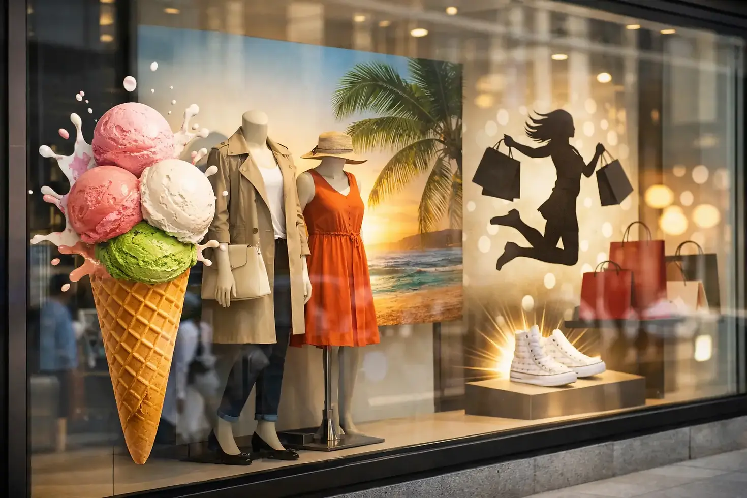
12 Retail Window Graphics Ideas That Sell

A blank shop window is expensive space. It faces the pavement all day, reaches people before they cross the threshold and can make a business look established or instantly forgettable. The right retail window graphics ideas turn that glass into a working sales surface - promoting what matters, supporting the brand and giving passers-by a reason to stop.
For independent retailers, multi-site operators and customer-facing commercial premises, the goal is not simply to cover the glass. Graphics need to be legible at a glance, suitable for the location and tough enough to stay looking sharp through changing weather, cleaning and day-to-day use.
Retail window graphics ideas that earn their space
1. Make one clear offer impossible to miss
A large seasonal offer can be one of the most effective uses of a front window. Think sale periods, new menu launches, finance options, bundle deals or a simple percentage saving. Keep the headline short, make the key figure large and ensure it can be read from across the pavement rather than only from directly outside the door.
The trade-off is permanence. A short-term promotion should use removable vinyl or poster systems, not a costly permanent application that has to be stripped away a fortnight later. Plan the graphics around your promotional calendar so updates are straightforward and the window never looks tired.
2. Use frosted film to create privacy without closing off the space
Frosted window film is ideal where staff need privacy, customers need discretion or the interior view is not doing the business any favours. It works particularly well for salons, clinics, offices, showrooms and consultation areas. Applied as a full band, lower-panel coverage or a carefully designed pattern, it softens the view while still allowing natural light through.
It can also carry branding. A frosted logo, repeated motif or cut-out lettering gives a polished result that feels part of the premises, rather than an afterthought. For internal glass, manifestation markings may also be needed to make panels visible and help meet relevant safety requirements.
3. Put your best-selling categories on the glass
New visitors should understand what you sell in seconds. Category-led graphics are useful for businesses whose offer is not obvious from their name or interior display. A specialist food retailer might highlight fresh produce, bakery and takeaway. A trade counter could signpost tools, fixings, workwear and collection services.
Avoid listing everything. Three or four strong categories are more effective than a crowded catalogue. The wording should answer the basic question a passer-by is already asking: is this place for me?
4. Give your brand room to breathe
Not every window needs to shout an offer. A clean logo application, brand colours and one concise statement can create a confident storefront, especially where the business relies on quality, trust or a premium service. This approach works well for professional services, estate agents, automotive showrooms and established local retailers.
Precision matters here. Poor colour matching, uneven spacing and bubbles around the vinyl are far more visible on minimalist graphics. A properly prepared surface, suitable material and experienced installation make the difference between a smart branded frontage and something that looks temporary.
5. Build a seasonal changeover programme
Christmas, bank holidays, summer events, back-to-school periods and local occasions all give retailers a reason to refresh the window. Seasonal graphics create movement on the high street and give regular customers something new to notice.
The strongest schemes retain the core brand rather than reinventing it every quarter. Use the same typefaces, colour rules and logo placement, then introduce seasonal images or messages around them. For businesses with several branches, this consistency is what makes a campaign feel planned rather than pieced together.
6. Use full-colour printed window vinyl for visual impact
Where you need product photography, bold artwork or a campaign image that cannot be achieved with cut vinyl, printed window graphics provide far more creative scope. They can be used as full panels, feature sections or layered with translucent and frosted materials.
This is particularly useful when the shop interior is being refurbished, stock is limited or the view behind the glass is operational rather than attractive. The practical question is how much daylight and visibility the premises need. Full coverage creates impact, but it can darken the interior and block views in both directions. Perforated window film may offer a better balance in some locations, although the effect depends on lighting conditions and viewing angle.
7. Turn opening hours into a proper part of the design
Opening times, contact details and payment information are often stuck onto a door as an afterthought. They are essential customer information, so treat them like part of the brand. Use clear, durable vinyl, position it at an appropriate eye level and leave enough contrast for it to be read easily.
This is also the right place for practical messages such as collection points, accessible entrance directions, appointment-only notices or delivery information. When customers can find the basics without asking, the entrance works more efficiently for everyone.
8. Show real proof, not vague claims
Window graphics can display ratings, accreditations, years in business, trade memberships or a short customer promise. For a local business, these details can remove uncertainty before a customer walks in. ‘Family-run since 1994’ or ‘Approved installer’ means more than generic phrases about quality.
Keep claims current and defensible. Out-of-date award badges or certificates create the opposite of the intended effect. If your business operates under a franchise, national brand or local authority framework, make sure approved artwork and wording are used exactly as required.
9. Make a construction hoarding or vacant unit work harder
Retail graphics are not limited to finished storefronts. A shopfit, redevelopment or incoming tenant can use temporary window vinyl to create anticipation, control views into the work and maintain a professional public-facing appearance. ‘Opening soon’ is useful, but it is stronger when paired with a clear opening date, service teaser or recruitment message.
For larger sites, the graphics should be planned alongside hoarding, site signage and wayfinding. This prevents duplicated information and keeps the customer journey clear while works are underway.
10. Create a window that supports click and collect
For many retailers, the shopfront now supports both walk-in trade and online orders. Collection instructions, QR codes, collection hours and designated entry points can all be included in window graphics. Done well, this reduces confusion at busy times and reinforces that the business is set up for convenience.
Do not rely on a QR code alone. It should sit alongside a clear benefit or instruction, and it must be large enough to scan from a sensible distance. The window should still communicate something useful to customers who never scan it.
11. Use directional graphics where the entrance is not obvious
Units inside retail parks, larger premises with multiple doors and businesses set back from the pavement often need more than a logo. Arrows, entrance messages and service-point labels can guide people from vehicle to door without cluttering permanent signage.
This is a simple idea, but it has a direct operational benefit. Fewer customers wandering around the building or interrupting staff for directions means a smoother experience from the first visit.
12. Design for the window you actually have
The most successful graphics respond to the glass layout, door position, surrounding signs and sightlines from the road. A design that looks good on a flat screen can fail when divided by mullions, obscured by shelving or viewed at speed from a passing vehicle.
Measure carefully, photograph the frontage and consider where pedestrians approach from. At KR4 Graphics, this practical planning sits alongside the creative work, production and installation. It is how a concept becomes a finished window display that looks right in the real world, not just in an artwork proof.
Choosing the right material and finish
Material choice should follow the job, not fashion. Cut vinyl is clean and durable for lettering, logos and simple shapes. Printed vinyl suits detailed artwork and campaign visuals. Frosted film offers privacy and a refined finish, while perforated film can provide graphic coverage with some outward visibility.
Ask how long the graphics need to last, whether the glass is internal or external, how often it is cleaned and whether the display must be changed seasonally. These answers affect the adhesive, laminate, print method and installation approach. A cheaper material can be perfectly sensible for a two-week campaign, but it is rarely the right answer for a permanent branded frontage.
Keep the message visible from the pavement
A retail window is not a brochure. Customers usually have only a few seconds to take it in, especially on busy streets or retail parks. Prioritise one main message, use strong contrast and resist filling every panel with copy.
Before approving artwork, stand back and ask what someone would understand from five metres away. If the answer is unclear, simplify it. The best window graphics do not make customers work - they make the next step feel obvious.
Your frontage is already part of the sales team. Give it a clear job, use materials that suit the site and install it properly, and it can keep bringing the right people to the door long after the first impression is made.


Comments