

How to Spec Window Manifestation for Your Site

A clear glass partition can look smart on a drawing and cause problems the moment the building is occupied. People walk into it, visitors cannot find the entrance, and a reception area that should feel professional starts looking unfinished. Knowing how to spec window manifestation properly means balancing visibility, safety, privacy and your brand - before the installer arrives on site.
For offices, showrooms, retail units, healthcare settings and public buildings, manifestation is not an afterthought. It is a practical part of the fit-out. Get the specification right and the graphics will help people move through the space safely while making every glazed surface work harder for the business.
Start with the purpose of the glass
Window manifestation is a visible marking applied to glazing, usually as cut vinyl, printed film, frosted film or a combination of these. Its first job is to make otherwise hard-to-see glass apparent. That applies to full-height windows, glazed doors, internal screens, meeting room partitions and shopfronts.
The right solution depends on what the glass needs to do. A corridor screen may only need a simple safety band. A boardroom could need a level of visual privacy without cutting out daylight. A street-facing window may need brand graphics that catch attention while still allowing staff to see out.
This is why a generic row of dots is not always the right answer. It may meet the practical need for visibility but do very little for the customer experience or the brand. Equally, a full printed window treatment can be impressive but excessive if the room relies on natural light. Specifying starts with a clear use case, not a catalogue finish.
How to spec window manifestation for compliance
For glazing in critical locations, manifestation should provide a clear visual contrast between the person approaching the glass and the surface itself. In most commercial settings, the usual approach is to place markings in two horizontal zones: one between 850mm and 1,000mm from finished floor level, and another between 1,400mm and 1,600mm.
These heights are widely used to support Building Regulations guidance for the safe use of glazing. They help ensure markings can be seen by people of different heights, including those approaching from either side of a glazed screen or door. Door furniture, rails and handles can sometimes contribute to visibility, but they should not be assumed to replace clear manifestation without checking the whole arrangement.
A good specification should state the following in plain terms:
which panes and doors require manifestation, including both sides where relevant
the two finished installation heights, measured from the completed floor level
the pattern, logo device or graphic dimensions and spacing
the required contrast against the background beyond the glass
the film finish and colour, plus whether it is applied internally or externally
any privacy, solar-control, security or branding requirement alongside the safety marking
Do not rely on a floor plan alone. A line marked "glass" can hide a host of variables: double-glazed units, fire-rated screens, sliding doors, framed sections, tinted panels and changes in floor level. The finished environment is what matters.
Contrast is more than choosing a dark colour
Manifestation needs to stand out against what a person can see through the glass. A white frosted dot may read clearly against a dark meeting room wall, then disappear against bright sky or a pale corridor beyond. A dark grey graphic may look sharp from outside but become weak when viewed from the other direction.
This is where site knowledge matters. Consider lighting throughout the day, internal finishes, external views and whether the glass separates two bright spaces. A contrasting pattern on both sides, or a design that combines frosted and coloured elements, may be the better practical answer.
Branded manifestation should still be legible as manifestation. Fine lines, subtle tints and small logos can look excellent up close but fail to define the glazing from a distance. The strongest schemes use recognisable brand components at a scale that works across the room.
Choose a design that works with the building
A repeated dot or square pattern is a dependable choice for busy commercial sites because it is clean, economical and easy to reproduce consistently. It suits corridors, schools, offices and multi-site premises where a unified appearance matters.
For customer-facing areas, there is more opportunity to bring the brand into the treatment. A logo repeated at suitable intervals, a geometric pattern drawn from the brand identity, or a frosted band with a solid-colour accent can turn plain glass into a considered feature. In a showroom or reception, this can make the first few seconds of a customer visit feel more organised and professional.
Privacy is often the deciding factor. Frosted etched-effect films obscure views while allowing light through, making them useful for meeting rooms, consultation spaces and glazed office fronts. The trade-off is visibility. If full frosting is used at eye level, it can make a space feel enclosed, so many clients choose a frosted central band with clear glass above and below.
Printed window film offers more design freedom, including imagery, gradients and campaign graphics. It is particularly useful for retail and promotional applications, although it needs careful artwork planning. Large blocks of print can reduce daylight and make internal spaces feel darker. If outward visibility is a priority, perforated film may be appropriate for exterior-facing glazing, but it is not a substitute for internal safety manifestation on a glass partition.
Specify the material for the real environment
Not all films are suited to every pane, and the cheapest option can become expensive when it lifts, fades or needs replacing early. The specification should reflect the location, expected traffic and lifespan of the graphics.
For internal office glazing, a quality polymeric or cast vinyl may be chosen according to the detail of the design and expected duration. Small, precise shapes and long-term branded installations benefit from stable, durable materials. For exterior windows, weather exposure, cleaning regimes and sunlight become much bigger factors. Printed graphics also need the right overlaminate where protection from scuffs, moisture and UV exposure is required.
Ask how the glazing is constructed. Some units have specialist coatings, films, heating elements or manufacturer restrictions. Applying film to the wrong side of certain glass can increase thermal stress or affect warranty conditions. This does not mean the project cannot go ahead - it means the glass type needs checking before material and application method are confirmed.
Cleaning also deserves a line in the handover information. Standard glass cleaner and a soft cloth are normally suitable for many installed films, but abrasive pads, harsh solvents and blades can damage the finish. Facilities teams should know exactly what has been fitted and how to look after it.
Survey before approving artwork
A visual mock-up is useful, but it is not a site survey. Before production, measure each glazed elevation, note mullions and door frames, identify handles and access-control hardware, and confirm which face of the glass will receive the film. Check for blinds, furniture, display units and existing graphics that could compromise the final effect.
For multi-site businesses, this stage is also where consistency is protected. Create a schedule that records pane references, artwork versions, material finishes, installation heights and photographs of completed areas. It makes future roll-outs, replacements and refurbishment work far more straightforward.
At KR4 Graphics, this practical approach is built into the job. Design, print and installation are treated as one workflow, so a graphic that looks right in artwork is also considered against the realities of glass, access, fixing details and the working environment.
Plan installation around the people using the site
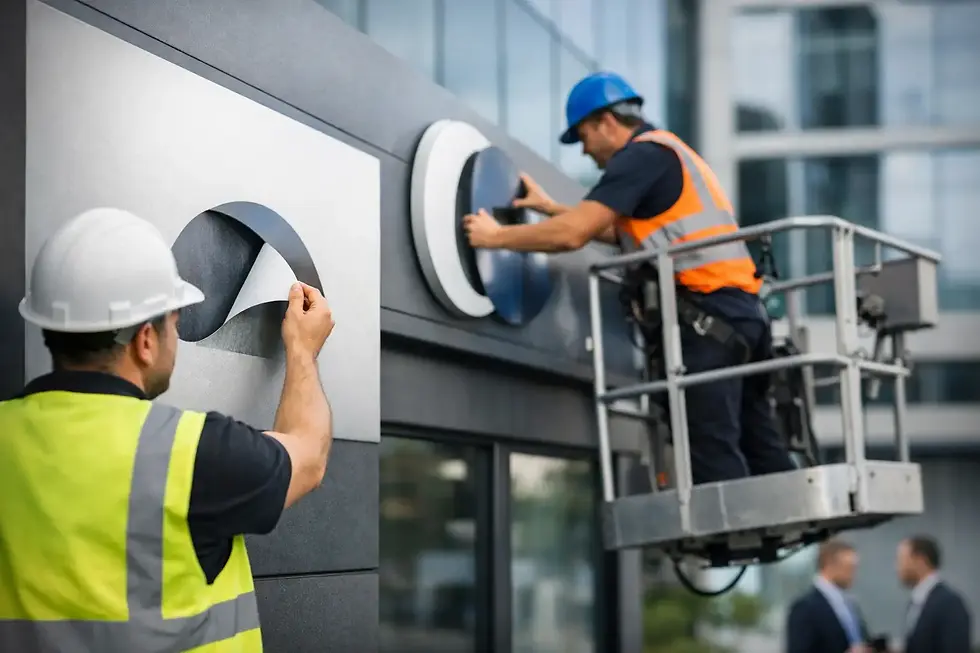
Installation can be quick, but it should never be treated casually in a live workplace. Reception areas, schools, clinical settings, warehouses and retail premises all need a plan that keeps routes clear and limits disruption. Access equipment, out-of-hours fitting and phased installation may be sensible where glazing is extensive or high-level.
The glass must be properly cleaned and prepared before fitting. Dust, silicone residue and surface contaminants can affect adhesion and leave visible defects. Once applied, graphics should be checked from both approaches, not just from the installer’s side of the glass. That is the moment to confirm the manifestation is clear, level and doing the job it was specified to do.
Make the specification easy to approve
The best window manifestation specification is not the longest one. It is the one that gives the designer, facilities team, contractor and installer no room to make different assumptions. Use marked-up elevations, a small material sample where appearance matters, and a clear written brief covering safety zones, branding, privacy and finish.
If the project includes several types of glazing, separate them into sensible categories rather than applying one instruction across every pane. A reception screen, fire door, shopfront and private meeting room may all need different treatments, even when they sit within the same brand scheme.
Good manifestation quietly improves a building every day. It prevents awkward collisions, guides people through the space and gives plain glass a purpose. Get a site survey and a working sample agreed early, and the finished result will look deliberate rather than added on at the last minute.


Comments